

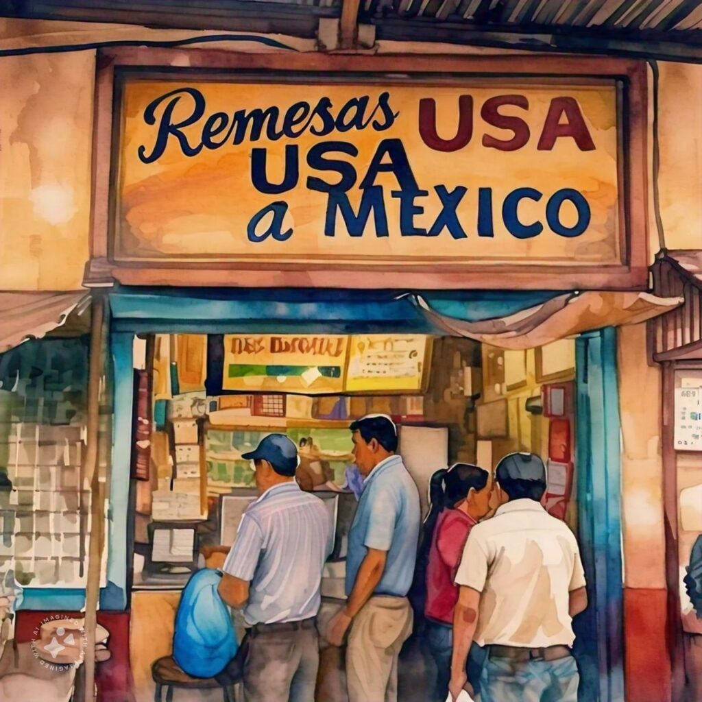
Need:
An innovation and design studio in San Francisco had been recently acquired by a Spanish Bank with the largest presence in Mexico. This bank also has a presence in the US and offers remittance services through more traditional channels and technologies. However, with the rise of remittance apps, they had an interest in entering this market (US-MX) with an innovative solution. The design studio was tasked with coming up with the new product to address this need.
Solution:
Phase 1
A previous research project had already identified personas and journeys around Senders and Receivers
- Enhancers send money for special occasions
- Sustainers keep a home in Mexico afloat
This initial previous project had already identified that both groups use smartphones, but Receivers sometimes have older versions and limited data plans.
Phase 2
Once personas were identified, the design team built the first concept of the app and needed to test it with users. The second phase of the study consisted on:
- A generative introduction to understand participants context and behaviors (need to send money, frequency, amounts, means, etc.)
- A concept test of app’s value proposition and it’s main features (either through the video or written statements)
- A cognitive walkthrough where participants will be able to get to know the app’s workflow and and provide feedback
I conducted 16 qualitative interviews to conduct a usability test with Senders (both enhancers and sustainers), all were born in Mexico and now are building their lives in the US — they have family back “home”. These users lived in Dallas, Houston, Chicago, LA, and Miami and …and Receivers, who are the Senders’ family members living in Mexico*. All are extremely grateful for help they get from their family in the US.
In this second round, it was discovered that the name of the app did not resonate with Senders or Receivers. The name was initially intended to refer to Panamerica as a region (US + Latin America), but the study uncovered that the word was not resonating with the audience, in fact the word used meant food – Bread – in Spanish (Pan). For Mexico in particular, the word PAN was linked to the acronym of a political party. As a result, the main recommendation was to consider a re-branding.
In addition to iterating on the workflows and features, the design team used the insights from this study to redesign the name as well as the feel and look of the app.
“The act of sending money for this specific audience is an act of connection, communication, showing appreciation, and love.”
Phase 3
The insights collected in phase 2 resulted in quick design sprints that aimed to address the findings, including the rebranding of the app.
This third research iteration aimed to evaluate the new look and feel, test 2 different names, and validate if the workflows and content (copy) worked for the specific needs this time around.
One key additional insight resulting from this round of interviews was that the app could also offer in-app messaging services, given that every user mentioned that they always used this remittance sending and receiving moment as an opportunity for connection and communication with their loved ones in the other country. The team included this insight in their roadmap for the next product iteration.
Results:
The project resulted in a successful launch for the team. The global bank approved the project and funded an initial pilot to launch the app in the US accompanied by a go-to-market strategy.

